Methodology
We conducted a total of 7 unmoderated tests on UserTesting.com as well as 4 in-person tests. We tested 4 flows and the overall test duration was 15 minutes on an average. Our target audience was first and second-generation immigrants residing in the United States.
In case of Usertesting.com, each of us conducted at least 2 tests. We initially restricted the device to be used for testing to mobile, however, the Figma mobile app has a lot of limitations in terms of prototype testing. All further tests, were therefore required to be tested on a desktop interface.
Main themes and insights
""
I would definitely use this app if it actually existed, in fact I'd even pay for it
In defense of the idea
All the users we tested against liked the idea of the application and expressed the importance of having such a product in the market. They were really enthusiastic about the overall idea which made us more confident about our process.
Inclusive Illustrations
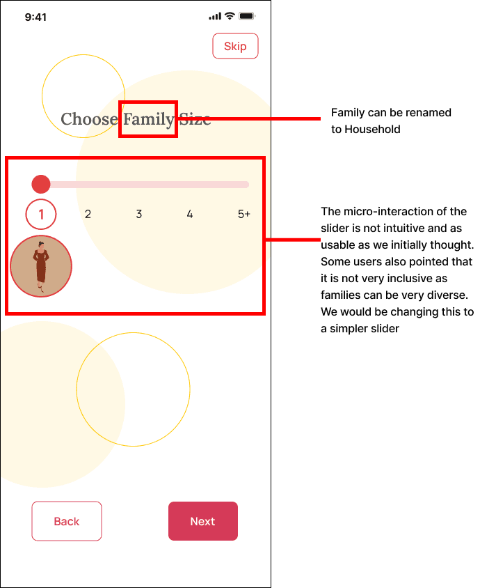
The onboarding process in the app explains the functionalities with a series of illustrations. However, as one user pointed out, these illustrations were not inclusive enough and did not reflect the diversity of the users we were aiming to target.
""
I really like that it has photos of people of color, but not everyone who is an immigrant is a person of color
""
Is there a Continue as Guest option? Because typically I wouldn't create an account rightaway
Guest Login
One user mentioned how they don't normally sign up for an account after downloading it. And that they would've appreciated the option to browse through the application as Guest before signing up and committing to the app. Looking back, this was pointed out by Professor in one of the previous milestones in a slighlt different form, however, the test gave us a clear idea of how to achieve it.
Intuitive Design
User thought the overall design process is very clean and intuitive. However, he mentioned that the use of yellow and red checkbox reminds him of errors. He suggested to use green as a reminder of success.
""
Everything seemed to be pretty straightforward, intuitive, and, and well designed other than just the color consistency
""
Everything seemed to be pretty straightforward, intuitive, and, and well designed other than just the color consistency
Interaction glitches
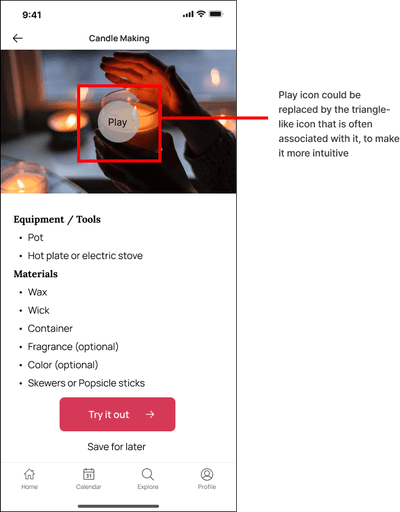
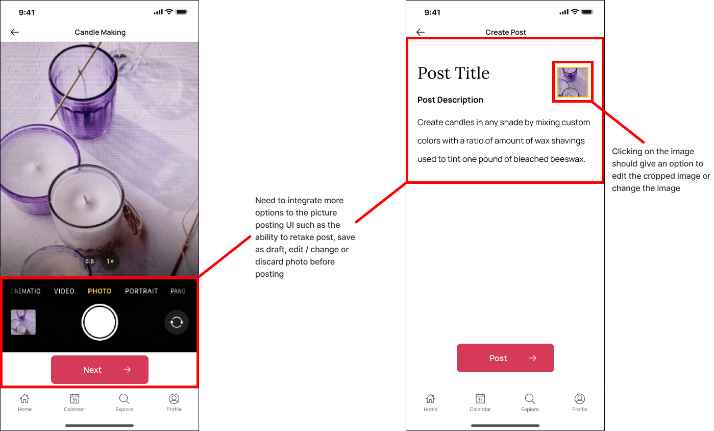
Unexpected interactions in the prototype was a frequent pain point for some users. Screens that they expected to have scrolling in, did not have them which confused the users. Additionally, some micro-interactions on the fancier side ended up being less usable than others.
Interaction glitches
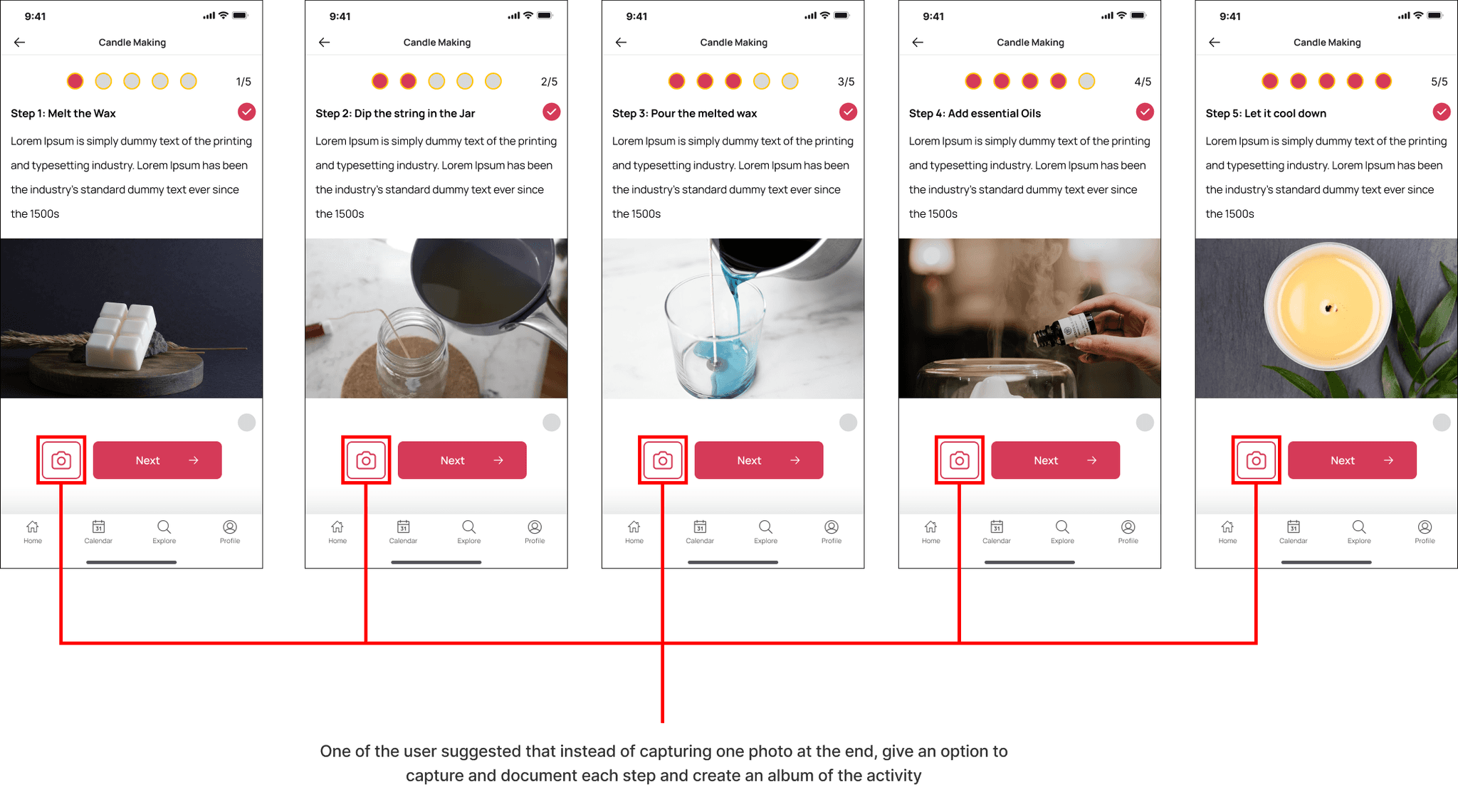
From the results we could understand that the users would have liked to explore features of the app more candidly to get to understand it better than just mechanically following instructions that are task oriented which doesn't tell them much about the app. This kind of a free flowing task would have also allowed us to gauge the usability of the app on a higher level.
""
I like the whole concept of the app, as an immigrant myself I can relate to the idea very well. But I feel the tasks are very limiting
Potential Changes & Recommendations
Task 1 - Onboarding


Task 2 - Doing an activity

Miscellaneous

Recommendations
Participant feels the typeface looks too basic, can consider changing the same to a livelier font that is more suited to the purpose of the app.
Understanding how much time a user would need to understand a concept or read a text before integrating a time based interaction or screen change.
Making the overall UI more intuitive and complying with industry standards better.
Make the color more consistent.
Introduce a Guest Login feature so the user can see what the app is about before going through the hassle of making an account.
Make the illustrations more inclusive and representative of the product mission.
Appendix
Milestone 6: Testing
Brief - Perform usability tests of your prototype on relevant users face-to-face and on UserTesting.com.